Summary
Think of this as a quick overview. Explore the full case study to follow my complete journey and see the final outcome of this project.
Note: These metrics are based on user testing. The project is currently under development and is expected to go live soon. After launch, we will collect more feedback and track metrics using PostHog.
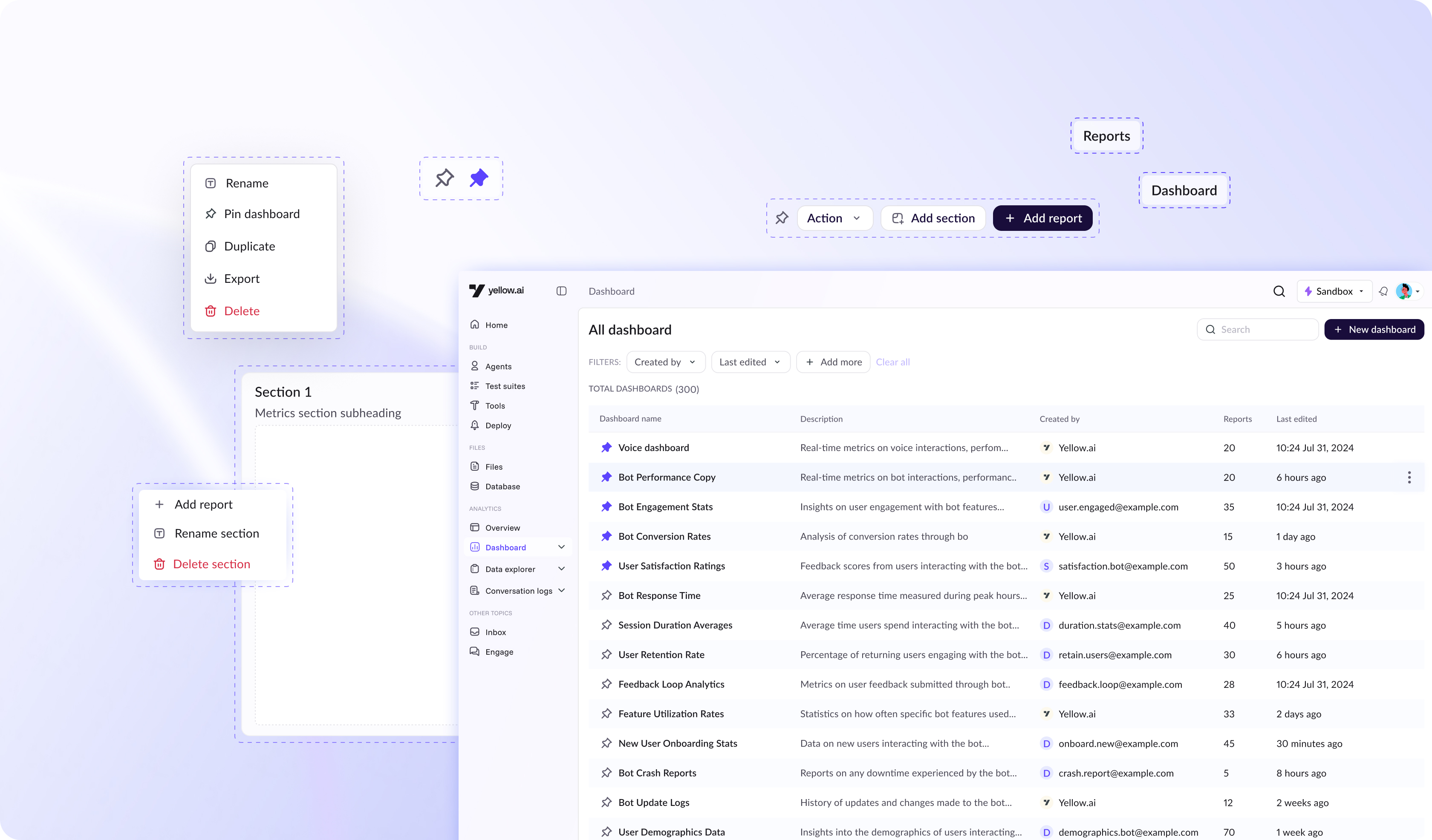
I redesigned Yellow.ai’s analytics dashboard to resolve the fragmented, inefficient experience and create a more connected, intuitive workflow for users.
The new design minimizes unnecessary tab-switching through an improved tabular layout with pinning capabilities, and introduces a unified flow that links reports and dashboards, making navigation more seamless and structured.
Additionally, interactions for rearranging, resizing, and managing widgets were rebuilt to provide smoother, more predictable control eliminating placement issues and enabling users to customize their dashboards with confidence.
Task completion rate in
user testing
90%
Reduce confusion between
reports and dashboard
65%
Fast dashboard navigation
73%
More intuitive & easy to use
100%
Problem statement
The dashboard’s fragmented experience slows down insight generation and forces users to depend on service teams for even basic reporting.
Context
Who are we solving for?
We divided users into power users and non power users:
- Power users - Power users are individuals who work deeply with data and use analytics tools extensively.
- Non-power users - Non-power users use analytics occasionally and usually need quick, simple insights rather than complex exploration.
What is dashboard
A dashboard is a consolidated view of key metrics and trends. At Yellow.ai, dashboards are made up of multiple reports and come in two types:
Default Dashboards – Pre-built by Yellow.ai with standard, ready-to-use metrics.
Custom Dashboards – Created by users or sales teams to tailor insights to specific needs.
What is a report
A report is a detailed, structured view of data used to analyze specific questions or time ranges.
Users can explore raw data, apply filters, and compare metrics to generate deeper insights. These reports are later added to dashboards